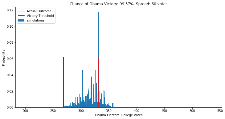
‘’'def plot_simulation(simulation):
fig, ax = plt.subplots(figsize=(12,6))
ax.hist(simulation, bins=np.arange(200, 538, 1),
label=‘simulations’, align=‘left’, density=True)
ax.axvline(332, 0, .5, color=‘r’, label=‘Actual Outcome’)
ax.axvline(269, 0, .5, color=‘k’, label=‘Victory Threshold’)
p05 = np.percentile(simulation, 5.)
p95 = np.percentile(simulation, 95.)
iq = int(p95 - p05)
pwin = ((simulation >= 269).mean() * 100)
ax.set_title(“Chance of Obama Victory: %0.2f%%, Spread: %d votes” % (pwin, iq))
ax.legend(frameon=True, loc=‘upper left’)
ax.set_xlabel(“Obama Electoral College Votes”)
ax.set_ylabel(“Probability”)
ax.spines[‘top’].set_visible(False)
ax.spines[‘right’].set_visible(False)
plot_simulation(result)
In the above code, we are actually considering only 90% of the histogram plot, so in which line of the above code, the computer gets to know to represent the 90% of the plot